Success comes from staying in the loop.
GIANT LOOP | Brand Boost
How do you update a rugged classic without sanding off its edges? By listening to its community, rethinking its communication, and building a design language tough enough to ride anywhere.
| SERVICES | Research Product Consulting Brand Communication Apparel & Footwear Design |
A legacy at risk.
Today, Giant Loop’s brand identity and products speak the same language – rugged, technical, and rider-driven. But, before this, this iconic heritage brand faced a common challenge: positioning to stand strong against younger competitors.

Born in the USA.
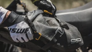
Founded in 2008, Giant Loop built its name in the US with gear designed for “real riders.” Their rugged luggage set the standard for adventure touring, and they were the first to bring softpacks into the mainstream. For years, their gear was synonymous with reliability.

But over time, fresher, younger brands entered the scene.
And in the face of so much noise, Giant Loop risked being overlooked. They needed to sharpen their visual identity and ensure their products stood apart. Their gear needed to preserve its trademark durability, and deliver big on style.

New markets, yes. New opportunities, maybe?
When Swedish brand USWE (a KISKA partner of many years) acquired Giant Loop in 2022, they connected the brand to the European market. Our goal was to elevate Giant Loop into the future without losing the authenticity that had made it iconic.
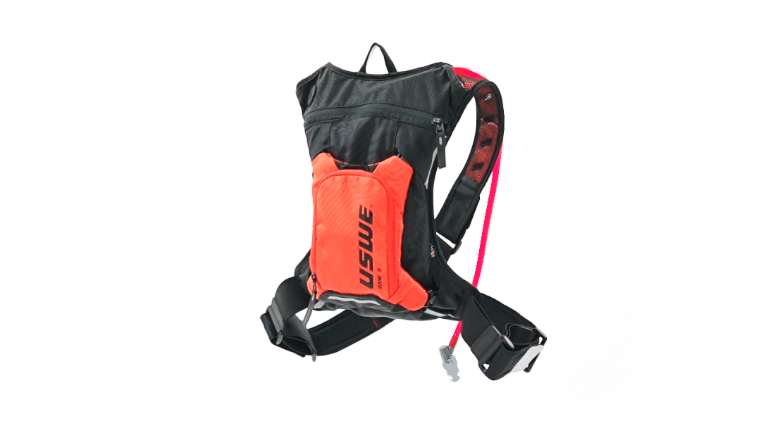
See the work we’ve done with USWE. It involved backpacks…

Our research proved one thing…
That the core of the brand needed to come from the riders; not a boardroom. We talked to them directly, scanned forums, and immersed ourselves in the culture. The message was consistent: Giant Loop is a community, not a corporation. Riders make the brand, not the other way around.
That spirit became the foundation.
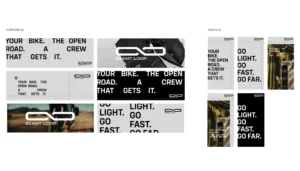
The motto – “Go Light. Go Fast. Go Far.” – stayed but evolved. It’s now embedded into every detail, a lived identity rather than just a line of copy. The iconic horseshoe-shaped saddlebag inspired the new infinite loop logo, a symbol of continuity, community, and motion.

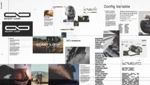
A rebuilt brand language from the ground up.
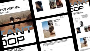
Strong, modern typography paired with a neutral, yet versatile, colour palette gave the brand longevity, while energetic accents injected a youthful edge. Photography became action-led and dynamic, capturing freedom, exploration, and the raw energy of riding.

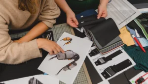
Once the new identity was chosen, our product team brought it to life.
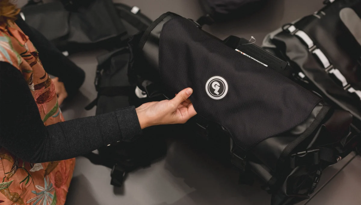
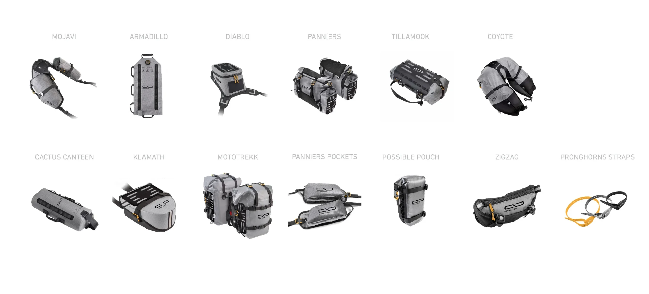
Select products were reimagined with sharper lines and more angular forms, meshes and textures that added technical depth, and refined details like buckles and trims that mirrored the new design language. The products became more than carriers of the brand; they became its strongest ambassadors.
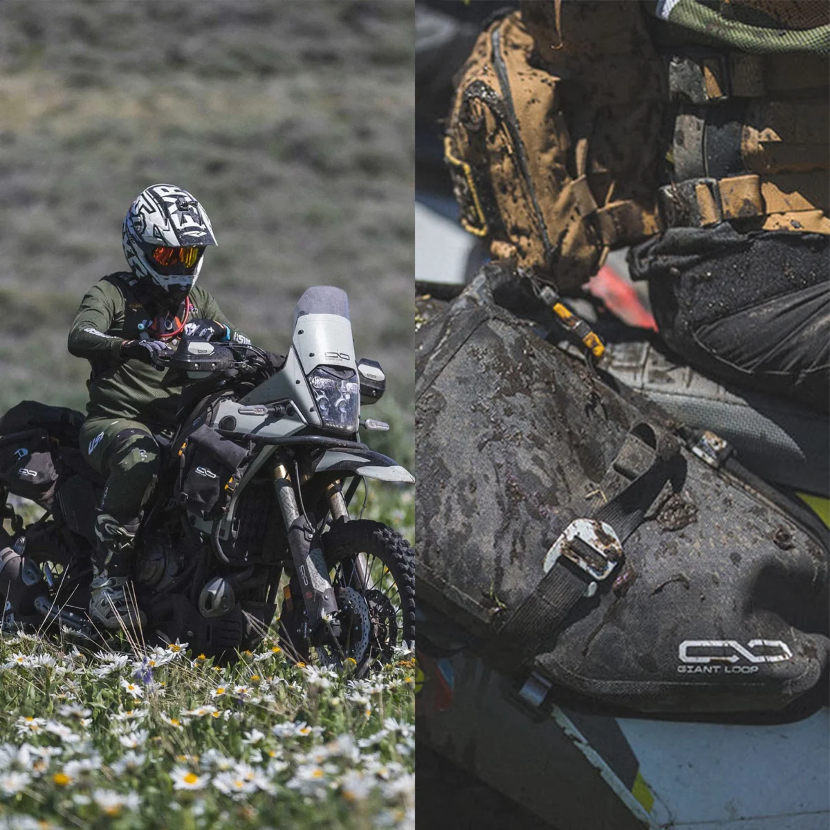
Most importantly, the brand now challenges younger competitors.
Instead of being overshadowed, Giant Loop is once again setting the standard for riders who want gear that’s tough, technical, and timeless.
Giant Loop’s gear has always been built to outlast the motorcycles it rides on – and now its design ensures it will outlast fleeting trends as well.
Check out more of our work.
Sharp thinking. Bold execution. KISKA generates brand experiences with business value. From strategic consulting to hands-on execution of your vision. See the results for yourself.
How to boost brand visibility with design.
Action sports brand USWE is an excellent case study for the impact of a long-term strategic relationship. From new collections to portfolio shakeup, USWE is easily recognised on the trails.
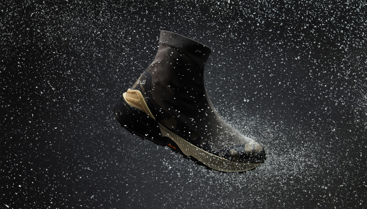
Ideating a winter collection.
ULU stepped into a new era at ISPO Winter 2024, unveiling hero products that move the brand deeper into snow sports and onto the trail.
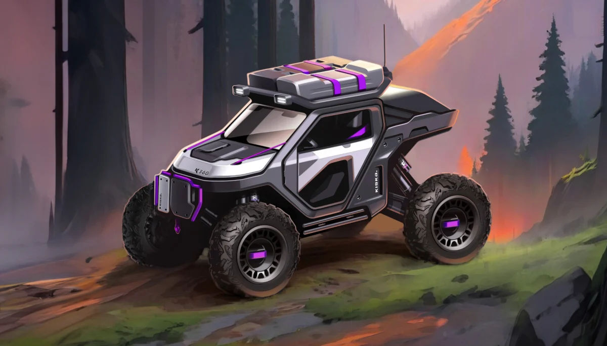
Future-casting for outdoor adventures.
Meet the K360® e-SSV concept – a bold vision for the future, designed to spark thoughts and fuse diverse worlds into a thrilling, ‘play-meets-function’ ride.